Pushing Forward forward
Anti-FGM charity FORWARD works in Africa and the UK diaspora to partner with communities around education and behaviour change for those still involved in the dangerous and damaging practice. While at Fat Beehive, I redesigned the brand and website, incorporating bold colour, repeating patterns and improved typography.
All photographs by Marianne Olaleye.
BRANDING • VISUAL IDENTITY • WEBSITE DESIGN • INFORMATION ARCHITECTURE • USER PERSONAS & JOURNEYS
FORWARD is the UK's leading African women-led organisation tackling female genital mutilation, child marriage and gender-based violence. The people behind it are bold, hopeful, and unashamedly solutions-focused. They see the women and girls they work with as survivors – not victims.
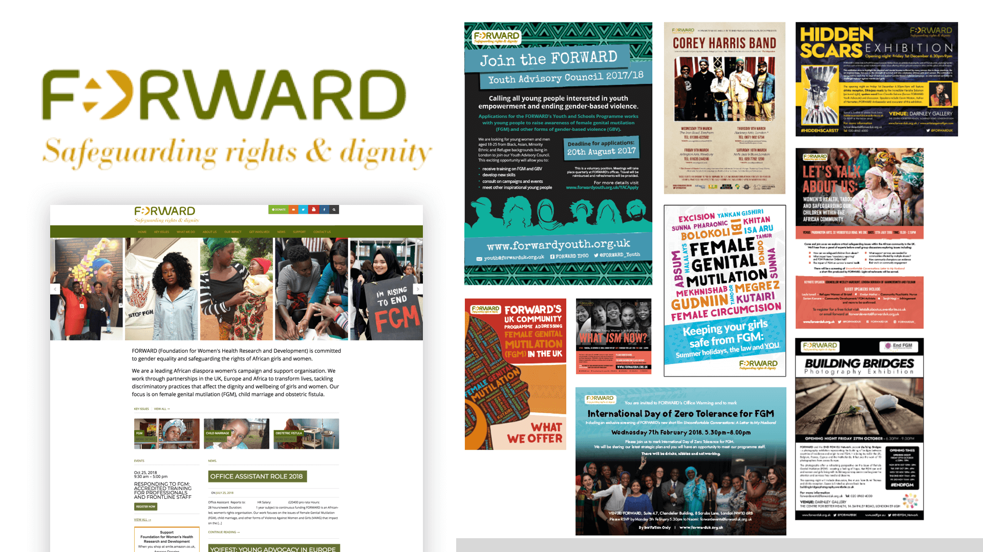
The old visual identity – assets shown here – didn't come close to reflecting that.
“We wanted to stand out, show our boldness and be unashamedly African in our look, and this is what Fat Beehive have achieved for us. The team were a joy to work with and went above and beyond to give us what we needed.”
Naomi Reid, Communications and Events Manager, FORWARD

Finding the right frequency
The brief was clear in spirit, if not always in detail: create something warm, optimistic and memorable. Something that could speak to women affected by FGM in the UK and across Africa, while also resonating with donors and funders. Something that felt culturally rooted, not generically "charitable."
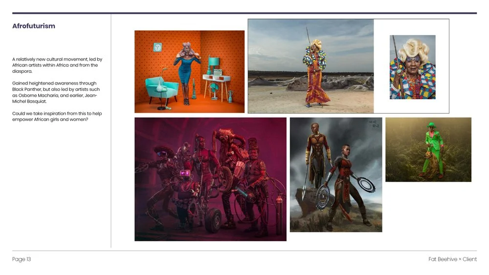
We started by looking outward. Auditing the competitive landscape and exploring what was possible – afrofuturism, vibrant pattern-making, textured illustration. There was real energy in that direction. Our first proposal leaned into it fully.
The team's response was honest and useful: yes to the vibrancy, yes to the patterns, yes to the idea of multiple lines representing collective motion – but not at the cost of continuity. They needed people to recognise them in what came next.
Evolution, not revolution. That became the creative compass.
A system built on meaning
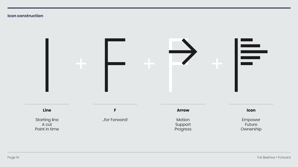
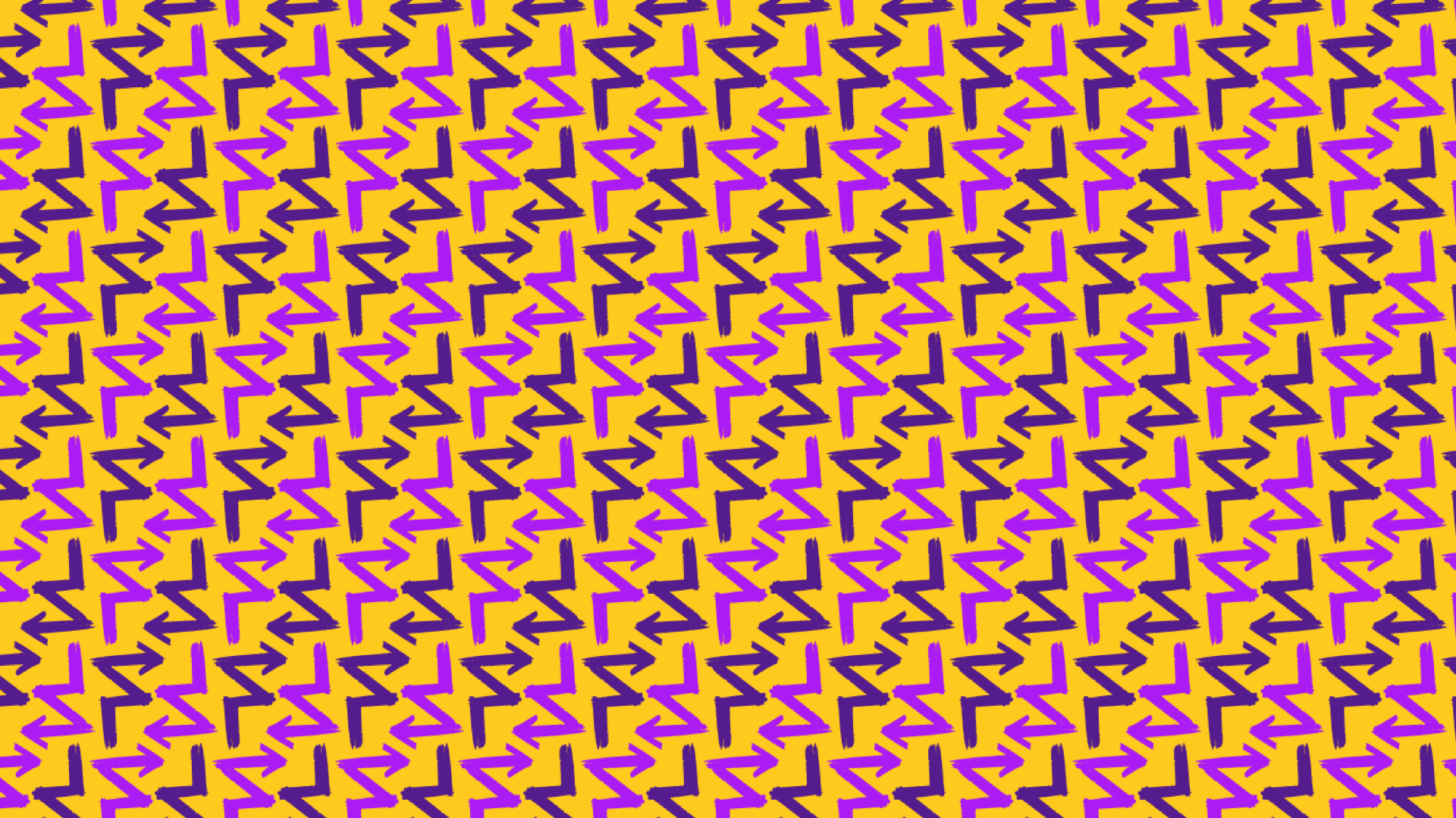
The existing logo carried three brush strokes – and they turned out to be worth keeping. They represent FORWARD's three interlocking pillars: partnerships, family and community. The belief that dignity, choice and lives free from violence can only be achieved together.
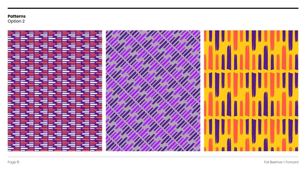
We built the new identity around that idea. The strokes remained, but the palette transformed: warm, bold, progressive. The patterns – derived from the icon and an abstracted 'F' – shift in colourway depending on context. Light and bright for celebration and hope. Deeper tones for more serious subject matter. A visual system that could hold the full emotional range of the work.
Cooper Hewitt, an open-source typeface from the Smithsonian's design museum, brought a contemporary sans-serif confidence that felt right without feeling corporate.
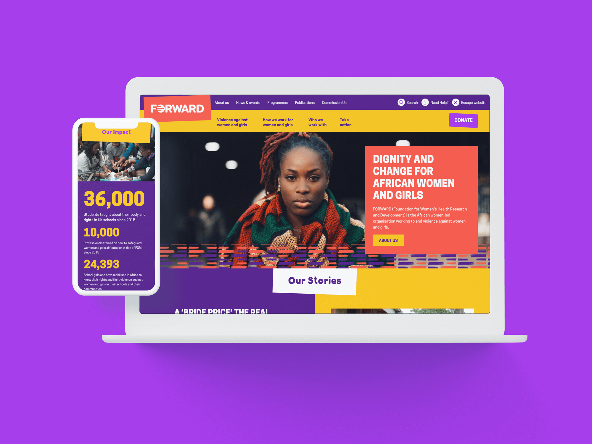
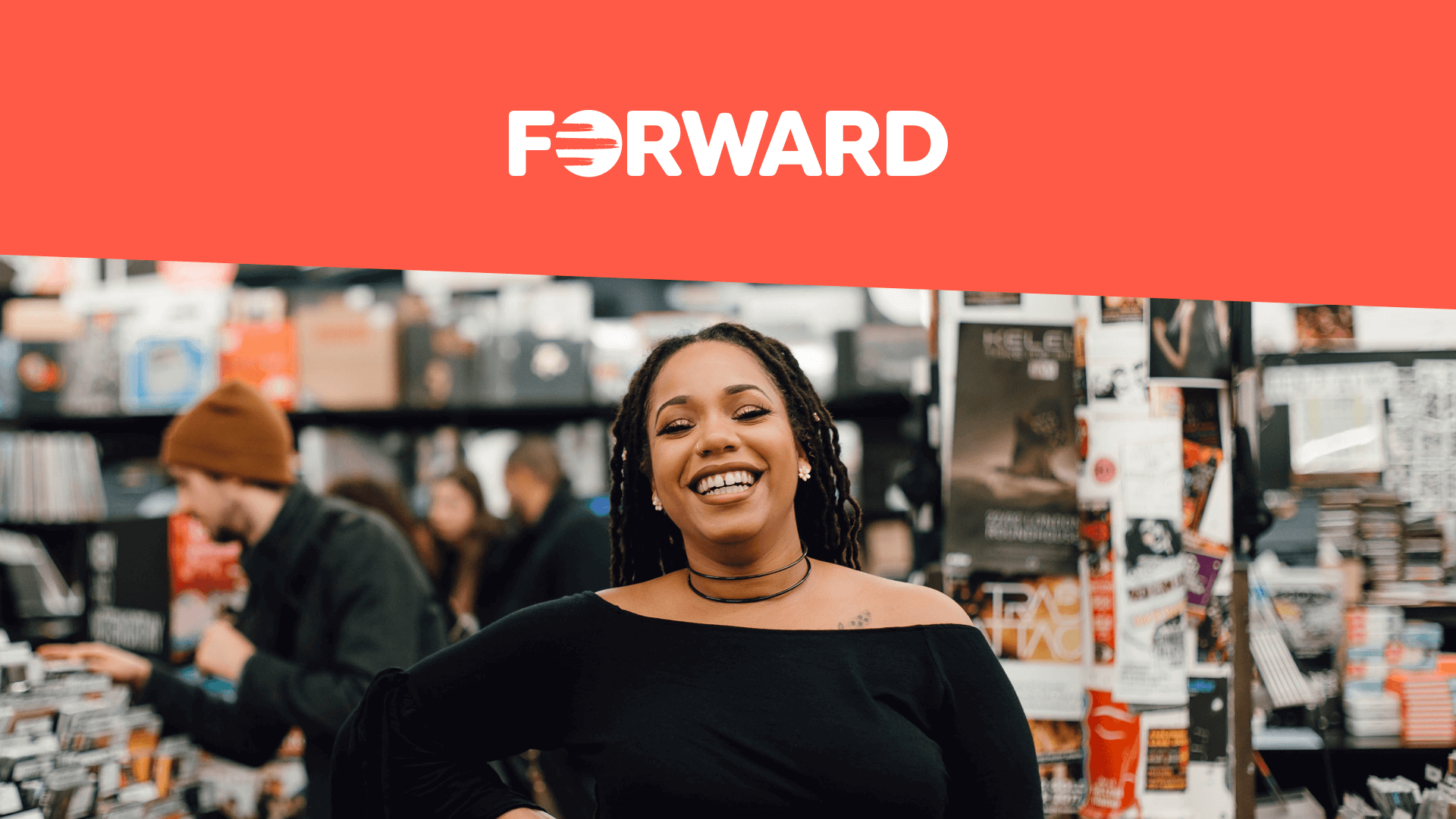
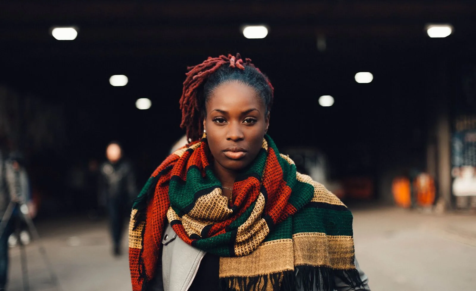
Photography as presence
One of the most important decisions we made was editorial. Working with photographs by Marianne Olaleye from FORWARD's own archives, we put real faces front and centre — powerful, direct, full of agency. From the moment you arrive on any key landing page, you know exactly who FORWARD is and what they stand for.
A website that respects its users
The site brought all of it together: bold block colours, rich patterns, and considered typography. But the details mattered just as much as the headline design. A donate button that wiggles when you hover over it. A textured background behind the newsletter sign-up. Small moments of warmth and delight that reflect an organisation that genuinely cares.
And then there's the 'Escape this website' button – a quiet but significant UX decision. An acknowledgement that some visitors may be in difficult or unsafe situations, and that good design should make space for that reality.


What we built to last
FORWARD needed a newsletter and payment functionality without the budget for full CRM integration. We worked with CiviCRM to implement a WordPress plugin that gave them exactly what they needed – no more, no less. Alongside it, we designed a suite of bespoke Page Builder components that let the team create a wide range of content types independently, without needing to come back to us every time.
That's the part I find most satisfying: leaving an organisation more capable than when we arrived.