Human Dignity Trust rebrand
Human Dignity Trust uses the law to fight for LGBTQI+ rights globally. They approached Fat Beehive to just redesign their website, but it quickly became apparent their old brand was eroding the trust built by their extraordinary work.
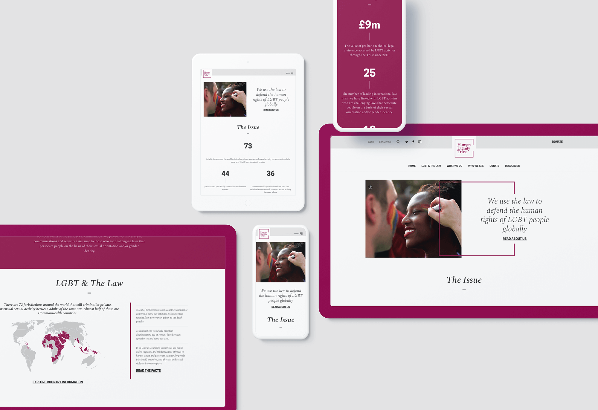
We therefore embarked on a complete rebrand, arriving at a simple wordmark, surrounded by a square with one open side, representing an opening to freedom. A red wine became the primary brand colour, hinting at leather-bound volumes of lawyerly texts.
The line device is used across assets, interacting with improved photography and clean use of white space, to present the charity in the professional light they deserve.
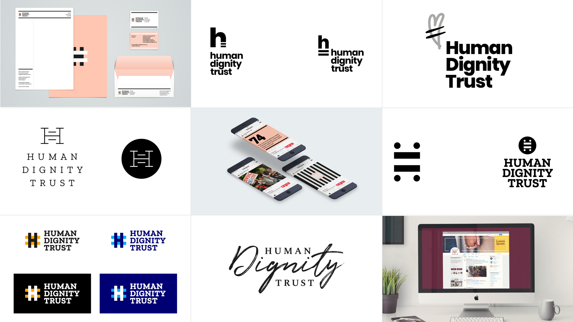
Creative exploration for the rebrand

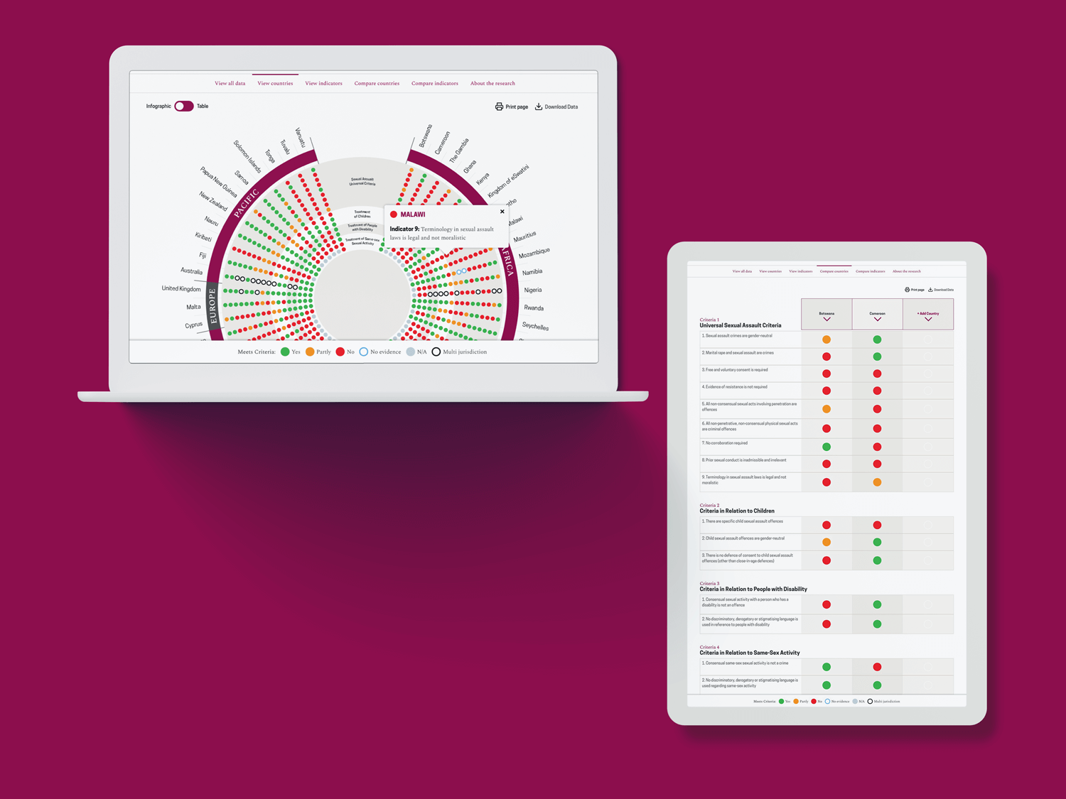
I also designed an interactive infographic displaying complex legislation related to sexual offences across the Commonwealth. Click here to see the full project.
“We've really enjoyed working with Fat Beehive to redevelop our branding and to build an elegant and powerful new website.
They've really helped us to put together a new brand that reflects who we are as an organisation and speaks to our diverse stakeholders.
The new website is strong and sophisticated and much better explains who we are and what we do. The team at Fat Beehive have been brilliant and patient, helping us to hit some tight timelines.”
Alistair Stewart, Senior Advocacy Adviser, Human Dignity Trust